Okay, by now you’ve probably heard about the six year old who guesses what classic novels are about based on their covers, but I can’t resist rehashing her cute take on this early On the Road cover:

“I think it’s about a car. A car that goes to Mexico, Indonesia and other places. It’s about a car that goes on all sorts of adventures. The guy on the cover is a teen, he likes to drive people places a lot. And he’s French.”
The cover she was looking at was the Signet 1958 edition. I love that she guesses that the book is an adventure in many places and correctly guesses Mexico is one of them.
The fact that she guesses the main character is French is so perfect. Of course, her guess is based on the drawing of a man in a Parisian-inspired striped shirt and scarf, which probably anyone would guess means the character is French.
Kerouac indeed was the son of French Canadian immigrants, but the kicker is that he’s usually thought of as either being very American or being anti-American. In the 1960s, beatniks were depicted as wearing black turtlenecks and berets. In reality, Kerouac didn’t wear a costume of striped shirts or black turtlenecks. If you look at most pictures of him, his clothes are nondescript. He wore a lot of t-shirts and flannel and overcoats.
That’s why it’s so fascinating to look at the 1958 edition from a historical perspective on the evolution of Kerouac’s image. As they’d do with any author, the publishing house tried to brand Kerouac. In 1958, the striped shirt and scarf flung over his shoulder imparted a worldly, European air, meant to invoke a bohemian vibe.

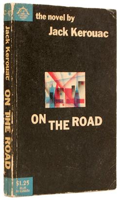
The only other edition published before that was the Viking 1957 edition. Of course, if you know about book publishing, you already know that Signet and Viking are both imprints of Penguin. The difference between these two covers, though, is starting. The cover of the first edition of On the Road, the Viking 1957 edition, was all black with a small rectangular abstract image in the center. Bouncing text announced the title. There was no image of a person or a car at all. And yet the book sold so well that by the next year when the Signet edition came out, the cartoony line drawing cover featured the ringing endorsement “This is the bible of the ‘beat generation.’”
It should be noted that this Singet cover not only featured the Frenchman, but in the background there was a woman in a bikini and a couple making out. Again, the publisher was trying to brand On the Road in a very specific way. The third incarnation of the cover design for the US edition of On the Road came in 1965 when the extraneous people were deleted from the design and just the Frenchman was left standing on his lonesome, without even a car. It lacked sex appeal, but someone must’ve liked it because two years later all the publisher did was switch from a cream colored background to a white background. The following year, 1968, saw a cover design of a cartoony couple embracing in a car. It marked a return to the sex theme.

Since then, the book has undergone many significant cover design changes, but what’s so interesting is that from the 1970s to the ‘90s the covers did not feature people at all. They returned to the more metaphorical design of the first edition, featuring variations of the sun or a car. It’s also worth noting that this was the time period in which Jack Kerouac fell out of popularity.
It wasn’t until Penguin released the 1991 paperback that the cover design included a people again. And this is where it gets really interesting. The romance angle is completely dropped and has not been seen in any US cover since the Signet 1968 edition. Now, the focus becomes about friendship—a bromance, if you will—and cool hipsters hanging out in gritty New York. The cover of the 1991 edition is a photograph of Jack Kerouac and Neal Cassady, the real life inspiration for the main characters of the novel. The Penguin 1994 edition a collage of photos of Kerouac and his friends. The US doesn’t see another woman on the cover until the Penguin 2011 amplified edition, which again embraces the photographic collage style.

Other covers published between the ‘70s and today tended to be text only, feature landscape (with or without a car), or a picture of the lone traveler. They tend to be spectacularly uninspired and ugly.
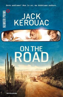
In Germany and France, where the film version of On the Road has already been released in theatres, there are new editions with covers boasting the poster image for the film. Will we be seeing a US edition with the actors’ faces instead of Kerouac’s on the cover?
Which cover inspires you to read On the Road?
Tags: cover design, Jack Kerouac, On the Road, On the Road film, Penguin


